Social Media Campaign Projects
Whinny & Mane Horse Sanctuary
72 PPI, RGB color
Design applications: Adobe Illustrator and Photoshop
Project Outline
Whinny & Mane Horse Sanctuary is a nonprofit equine rescue whose mission is to rescue unadoptable and unwanted wild horses and to train young horses for adoption. They also offer educational programs to attract donors, sponsors, and volunteers. After a video of one of their rescue horses went viral on Facebook, the sanctuary wanted to expand its social media presence to reach a broader audience and enhance fundraising efforts. The project's goal was to create visual content for the sanctuary’s social media fundraising campaign.
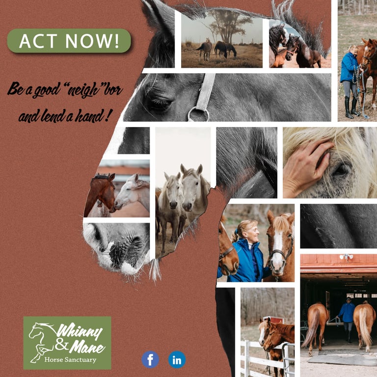
Instagram visual content (finalized) - 1080 x 1080 pixels
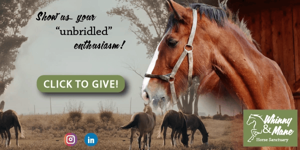
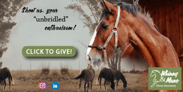
Facebook visual content - 600 x 300 pixels
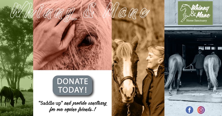
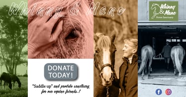
LinkedIn visual content - 1200 x 627 pixels
Edited images where horses are the main subject matter and the interactions between horses and humans are captured were used to help highlight the brand's mission. Being that social media is a visual platform, the images were used to create a visual narrative and to bring the brand's story to life. The images were arranged in a coherent way to help convey a story to the audience. In the Instagram and LinkedIn posts, the story I hoped the audience would get a sense of is that of horses being rescued and receiving refuge. Call-to-action text and buttons were used to encourage the audience to get involved and donate.


Color Palette
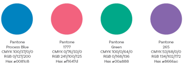
The brand's color palette allows for flexibility in communications with their varied audiences. Using the specific values ensured consistency across all media.
Typography
Header and Body Copy
Subheader
Chaparral Pro Regular and Calgary Script were used together to create distinction and visual interest.
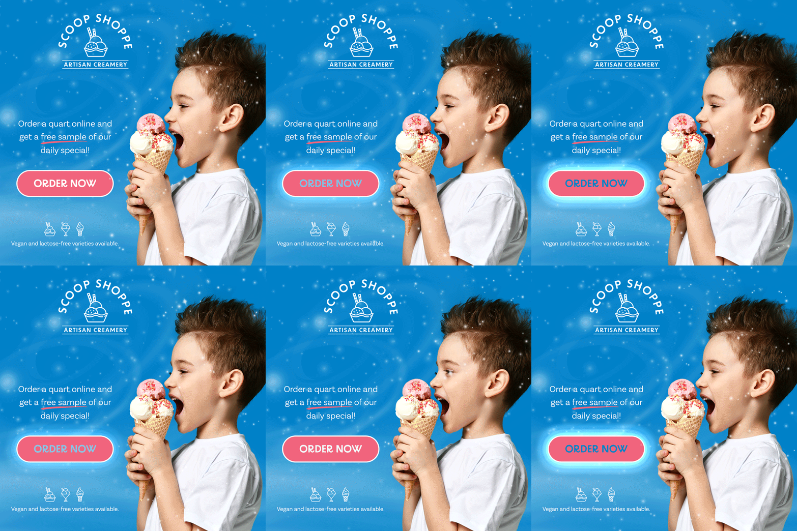
Scoop Shoppe Artisan Creamery
1080 x 1080 pixels, 72 PPI, RGB color
Design application: Adobe Photoshop
Project Outline
Scoop Shoppe Artisan Creamery is a niche ice cream company that handcrafts small batches of artisanal ice cream daily. They use all organic ingredients and offer vegan and lactose-free options. The business owners wanted to expand the brand's reach to the surrounding areas through online ordering. The goal of the project was to create a social media advertisement that effectively communicates their passion for their brand and their brand story and promotes online ordering.
The overall concept of the ad revolves around evoking joy, indulgence, and health-conscious enjoyment through clean visuals and vibrant elements that appeal to the senses. The animated snowfall-like effect in the background adds a dynamic, magical touch to the ad, helping to capture and retain viewer attention. The target audience for the brand includes families with children, particularly health-conscious ones; busy adults who appreciate the niche ice cream market and like the idea of being able to order online; and individuals with dietary restrictions. The ad successfully meets the audience’s requirements by incorporating cheerful, whimsical imagery, showcasing a young child enjoying a colorful ice cream cone. This visual element resonates particularly well with families, one of the core target segments. Highlighting the convenience of ordering online with an animated call-to-action button, paired with the incentive of a free sample, encourages immediate action.

Color Palette
Typography
