BeatsFest
Logo Design Project
Design application: Adobe Illustrator
Project Outline
BeatsFest is an international music streaming company founded in 2018. BeatFest is fast-growing, youth-focused, cloud-operated, subscription-based, and has a visionary mission of catering to a young, diverse, active audience. The brand is focused on providing young adults access to fresh, hip music and podcasts while giving new artists a platform to showcase their talents. BeatsFest approached me to create a combination logo reflective of their brand identity and vision and aligned with their target audience’s preferences. Key components for the combination logo were simplicity, readability, legibility, and scalability.
Primary vertical logo:
Primary horizontal logo:
Black logo versions:

White logo versions:
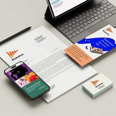
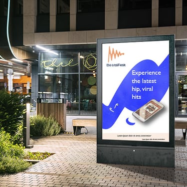
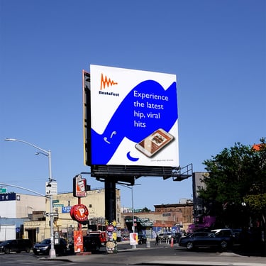
Mock-ups:
Hand-drawn sketches:
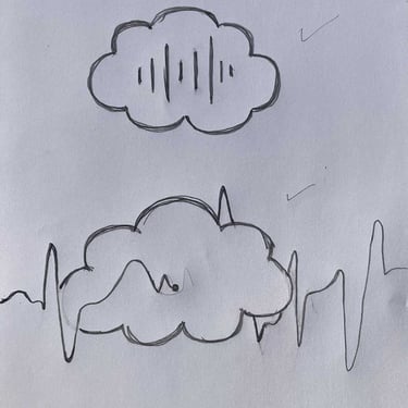
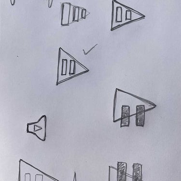
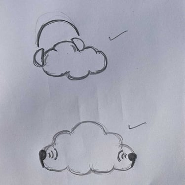
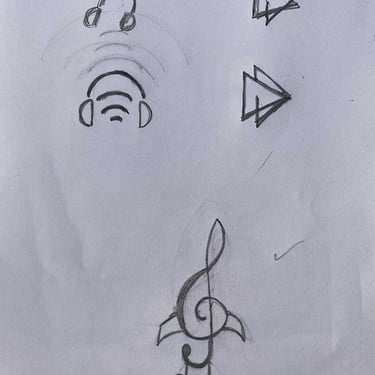
*(Click on image for full-screen preview)
*(Click on image for full-screen preview)
Digital sketches:
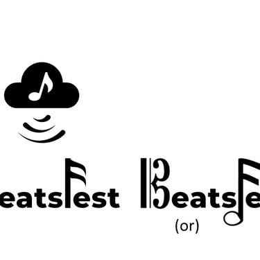
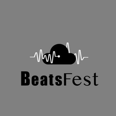


*(Click on image for full-screen preview)
Color Palette


Typography
The logo for BeatsFest features a stylized frequency/sound wave in vibrant orange, symbolizing the dynamic and energetic nature of music. The wave represents the rhythm and beats central to the art form, conveying movement and excitement. It represents the core service the brand provides and the fresh and diverse tastes of their users, as a frequency wave is a core characteristic of all styles of music. It also represents the brand’s love of music and their fascination with that pulsating beat in every genre of music.
Neon orange was selected as the primary color based on the target audience’s preference for ultra-vibrant neon-esque color palettes. Orange combines the energy of red and the happiness of yellow and is associated with joy, sunshine, motivation, and creativity. The blue for the wordmark portion of the logo complements the orange and creates high contrast. The dark blue represents the other side of the brand’s personality and tone of voice, which is more serious and businesslike. It adds a sense of stability and professionalism while ensuring the brand name stands out clearly in the logo. The wordmark infuses the logo with seriousness, elegance, strength, and authority.
The choice of typeface, sans serif, also aligns with designs seen in the brand's industry, the brand’s personality, and the target audience’s preference. Sans serif fonts say contemporary, fresh, adventurous, modern, approachable, and clean. They are minimal, legible, and easy to read, with easily recognizable characters.

